What animation styles and film techniques will resonate with your corporate video audience?
Have you ever watched a corporate video that felt kind of… off? The tone of the content didn't match the style of the animation, or the pacing seemed to stutter in places, or the visuals overwhelmed the voice-over so you missed the point entirely?
For anyone in charge of making animated videos for their enterprise, this is their worst nightmare. They've spent hours and hours developing an idea and turning it into a meant-to-be-valuable asset… only for it to be a little off.
And “a little” is often "off" enough to lose your target audience.
To create a video that connects and resonates takes the orchestration of a lot of parts. From audience-centered messaging to captivating shot composition, a good corporate video really is a symphony of storytelling devices.
And we've found that the key to achieving that pitch-perfect final cut is to be very familiar with all the instruments of this visual medium. This means going back to the basics of your animation styles and film techniques and studying what each is capable of and their intended effect on a viewer.
If that sounds like a big task to add to your to-do list, don’t you worry. We put it all together for you here! WITH a bunch of examples for your viewing pleasure.
And, if you're looking for a little extra (like an 8-step framework for choosing which of these styles and techniques to apply to your video), download the full eguide. It'll get you and your team nailing it in all things animation for business.
To get us started, here’s a video with a bit of everything. We promise, by the end of this article you’ll be able to deconstruct every scene:
The animation styles and film techniques that will make your corporate video sing
As you read on, please note the several synonymous (or nearly synonymous) terms for the various styles and techniques. For several of these, the classifications are squishy. And you'll find smart folks on the internet and on your team who have different definitions.
But finding a definition everyone can agree on really only matters for that second group - your team. So use this as a springboard, have a lively discussion to agree on terms, then stick with 'em!
Now, without further preamble...
Motion graphics animation
People also call it: Motion design, vector animation
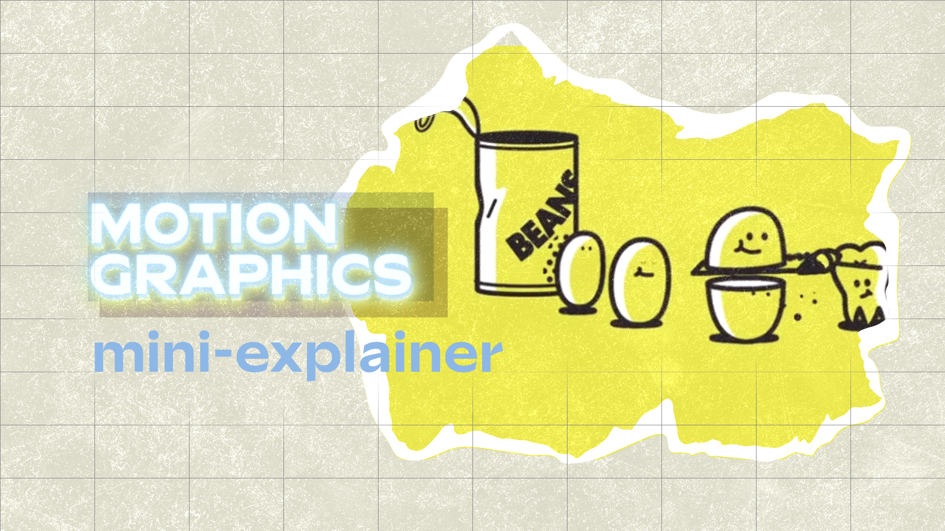
This style takes vector drawings (abstract shapes, lines, icons, or simple characters) and animates them. There is a lot of range in this style - from overlays on live-action footage to logo animation to the entire adorable cast of your gut microbiome (see below). So there's a lot of flexibility to take this popular animation style and make it your own while sticking to your budget.
Here’s an example of motion graphic animation in its most prevalent form - the explainer video:
-
The transitions in this video are built on a solid foundation of straight cuts (AKA hard cut, standard cut). This transition technique is one of the oldest in the book - the term “cut” comes from a time when film editors would physically cut the roll of film to join together different shots.
And because the straight cut is both longstanding and ubiquitous, it's very seamless. Often, viewers barely register it as they watch a video. This is your workhorse transition.
All motion graphics videos aren’t so serious though. Check out this mini-explainer for Men’s Health Magazine:
-
The camera movement here is all about the track (AKA truck) and the boom (AKA jib, pedestal) movements. Tracking is when the entire camera moves sideways, with the name coming from the live-action production technique of putting the camera on an actual track (or pickup truck!). Boom shots are similar except the camera moves up or down.
And though the “camera” in animation is a virtual one, you can still use all the same camera movement tricks of a live-action production.
Like in this video, you can use tracking to bring momentum to a scene, as it pulls the viewer forward in the spatial environment of the video and the arc of the story. Boom shots, meanwhile, offer an omniscient perspective to the viewer.
Kinetic typography animation
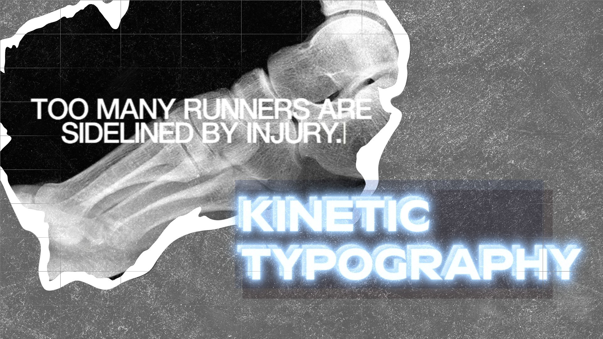
Kinetic typography is a style of animation that predominantly relies on animated text to convey the video’s message. And like the broad style of motion graphics, kinetic typography is especially useful and flexible for corporate video purposes. (Not to mention usually easier and more affordable to execute than other animation styles.)
Take a look at this product video for Nike, which uses kinetic typography, live-action footage, and scanned images in its various split-screen shots:
-
As the video progresses, it steadily draws out the viewer’s emotions as it goes from more detached wide and medium shots of the R&D process to more personal tight shots of the runners' faces after a good run.
Wide shots (AKA long shots) are shots that are framed to show the entire subject and much of the setting around them. Medium shots (AKA three-quarter shots) usually frame the subject from midsection up, while tight shots (AKA close shots, close-ups) highlight and frame the subject's face.
This shot composition progression works to bring the audience from a more distant consideration of the science behind the product to a more close, emotional connection to the value it brings, seen in the elation on the runners’ faces.
This next video explores the boundaries of the kinetic typography animation style by inserting real-life typography into live-action scenes using different materials like tape, spray paint, and fabric. Here, the typography echoes and emphasizes the voice-over:
-
The main transition in this video is the jump cut. Unlike the seamless straight cut, jump cuts are when the transition from one shot to the next in a scene is noticeable and abrupt. This is because the composition of the shots when you put them side by side is meant to be a little jarring and disrupt the viewer’s sense of the passage of time.
Jump cuts are typical of montages and you can use them to give viewers a jolt in narrative-based videos.
Or, like in this video, you can get the punch of a montage while smoothing out the rough edges of jump cuts by matching the composition from one shot to the next. In this way, even though each shot has different subjects that exist in different times, they are framed similarly to create visual cohesion.
Whiteboard animation
This animation style probably needs no introduction due to its overwhelming popularity in the 2010s and super straightforward method of animation.
Though one thing to note about whiteboard animation is that its analog (and some would argue purest) form involves capturing an illustrator physically drawing out a story on a whiteboard. Naturally, this approach is more time and resource-intensive than the shortcut of whiteboard animation software.
Whiteboard animation works well with educational content, like this video for business author Charles Duhigg:
-
In the first shot of the video, we see the illustrator constructing the SNL writer’s room and filling it with the story’s characters. This is an example of an establishing shot.
Establishing shots are often wide shots and they reveal the environment, provide context, and set the scene. You’d typically start most scenes with an establishing shot. However, you can also deliberately subvert that expectation to surprise your viewer and tease their curiosity.
Collage animation
People also call it: Cutout animation (traditional or digital)
In traditional collage animation, physical paper or photograph cutouts are arranged, recorded, and animated. But these days most are created digitally from scanned images or digital objects given the appearance of being made of paper.
It's a versatile style that can use vectors and even live-action footage in addition to cut outs to create dynamic digital collages. And depending on the mix, collage animations can go from an old-fashioned, low-fi appearance to a trendy, pop art feel - and everything in between.
In this example for the Kneading Dough podcast, the guest Laila Ali has her story visualized using photos and various other cutout objects:
-
For a few seconds at the start of the video, you can see an example of a talking head shot (AKA interview-style shot). This medium tight shot framing is a standard composition for interviews and can be framed head-on (like this one) or at a slight angle so the subject is looking past the camera, depending on who the interviewee is addressing. .
This next brief video leans into the look and feel of paper and uses black-and-white archival images to lend the authority of history to the argument of the video:
-
Though each shot has a minimalist look with only a handful of cutout images on a white background, the video still plays a bit with the depth of field, which is the distance between the closest and farthest objects in a shot that appear in focus.
For instance, at around 5 seconds, you see a wide shot of a battle with both the soldier in the foreground and the jets and paratrooper in the far background sharply visible. This is an example of deep focus, which is one way to convey a lot of information about the action or environment of a scenario. Shallow focus, on the other hand, is used to direct and keep the viewer’s attention on the one thing that is in focus in the foreground.
Hand-drawn animation
The name says it all. Though in corporate videos, hand-drawn animations are less likely to be physically drawn by hand frame-by-frame and more likely to be a “hand-drawn look” applied to digital 2D animation.
This style makes the most of all the imperfections and irregularities of something drawn by hand and gives off strong authenticity vibes. Here’s an example of a video putting that to great use:
-
This video uses some strategic zooms to shift between and connect the large-scale and the small-scale - the land and the individual shareholder.
You can use zooms for a range of effects, encouraging the viewer to look more closely as the camera zooms in, or to take a broader perspective as it zooms out.
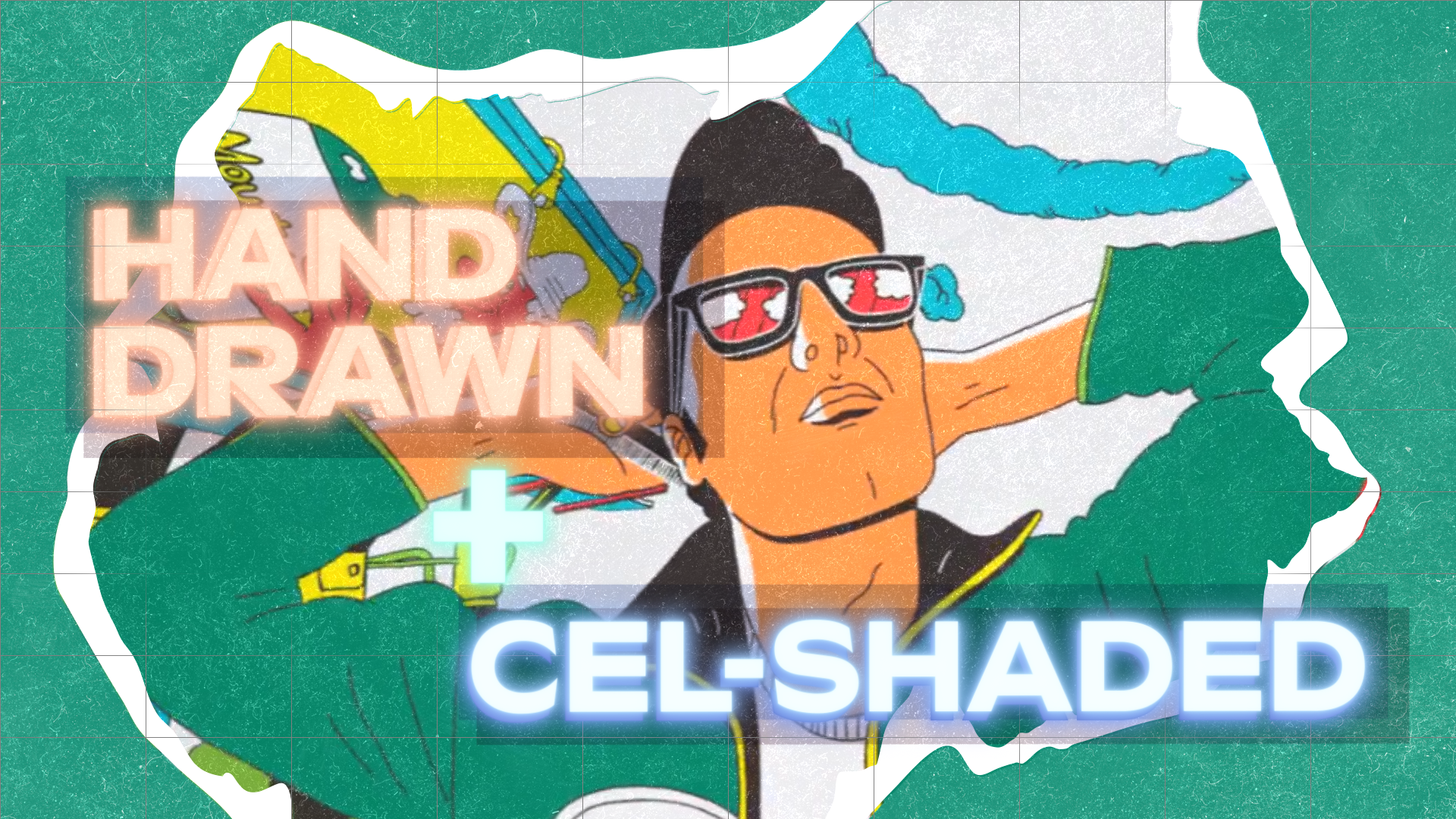
The hand-drawn style can also enter the third dimension, like in this brand video for Mtn. Dew that employs cel-shading (more on that style later):
-
The driving camera movement in this video is the dolly shot, which is where the camera moves toward or away from (or with) the subject in one fluid motion. The dolly shot works great here as it calls to mind the steady flow of history and captures all the incarnations of the Mtn. Dew lover over time.
Photorealistic 3D animation
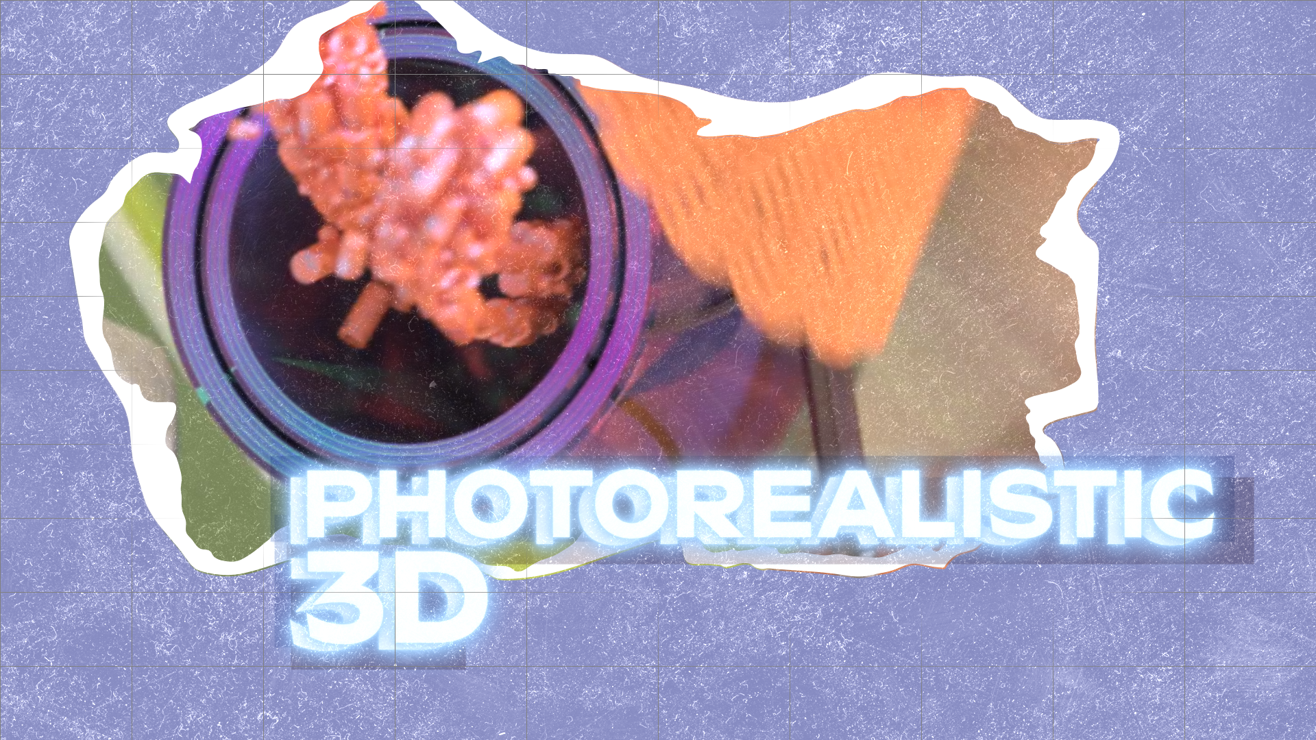
There are many sub-styles of 3D animation, which is, essentially, any animation that involves 3D objects in a 3D space. So the photorealistic flavor of 3D refers to animations that achieve the textures and movements of realism.
This style can be quite expensive, so many businesses will opt to have only a few objects animated in photorealistic 3D (like their product), or they’ll go for the less-refined-but-still-effective 3D model or mechanical animation styles for assets like training videos.
However, if folks have the budget, they can get gorgeous results like this gem:
-
If you watch carefully at the 22-second mark, you’ll catch a rack focus. A rack focus involves changing the camera lens’s focus from one object to another in a continuous shot. It's an effective way to redirect the viewer’s attention and it can add a little interest to a static shot (which is a shot with no camera movement).
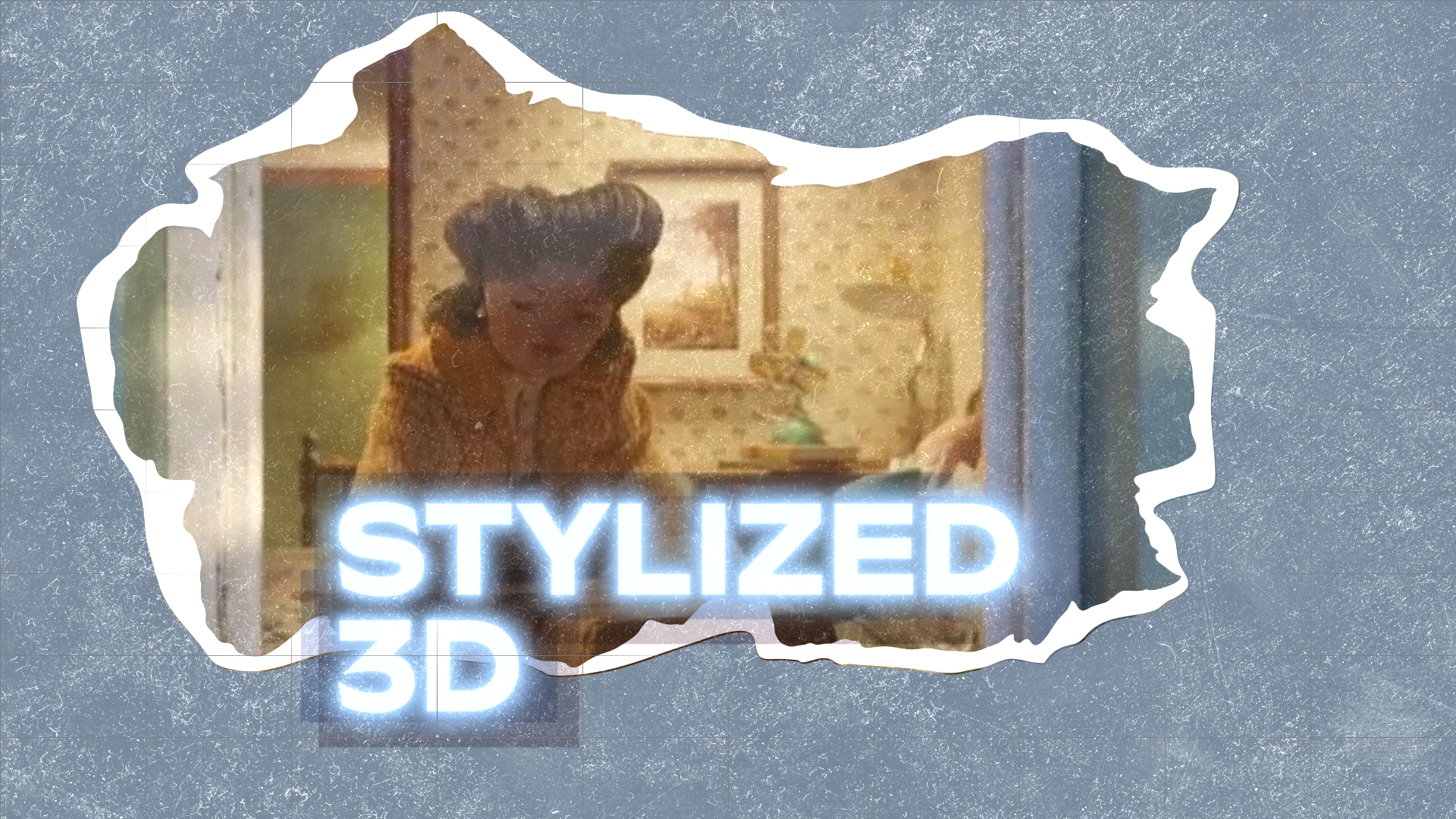
As the evolution of the objects in that video illustrates, photorealistic 3D animation doesn’t necessarily mean life-like. This next video uses an artistic, almost doll-like representation of the characters and their world, which helps to ground what is a very emotional story:
-
The opening sequence of Rosemarie’s childhood features several clever wipe transitions. A wipe transition is when one shot replaces another shot by crossing over it from one side. Here, the video uses objects or characters in the scene to crossover the frame and create the wipe.
This video also does some fun things with POV shots, which occur when the camera takes on the perspective of one of the characters.
For most of the video, Rosemarie’s first-person recollections are visualized with distant wide shots. But then, at 1:47, we see a tight shot of a letter with a picture of Rosemarie and her daughter from someone’s POV. In the same shot, the camera tilts up to show a set of opening doors, and we see old Rosemarie sitting at a train station. The next shot reveals the POV was that of her long-lost son, finally reunited with her.
POV shots are some pretty powerful stuff that you can use to help the viewer really inhabit a story.
Cel-shaded animation
People also call it: Toon shading
In this style, your typical 3D animation loses its realistic veneer (and long render time) in favor of simplified shaders that give it a more stylized or hand-drawn effect. The name is a reference to the style that started it all, traditional cel animation, and not only can this technique trim down 3D animation time, but it can also give you the best of both the 3D and hand-drawn styles.
Stella Artois makes the most of this style in this ad series that creates an immersive, vivid, and velvety-looking world of people living their best lives:
-
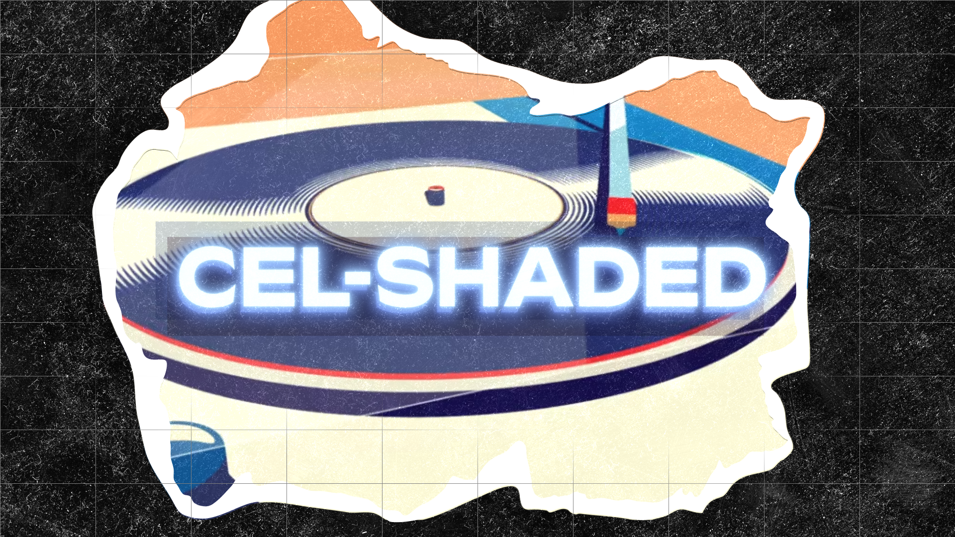
At the heart of each of these animated vignettes is another clever transition - the match cut. A match cut is when an action or an object in one shot is carried over to or reflected in the composition of the next shot. Like when the skim of the foamy head of the Stella cuts to the cream-colored center of a record playing. This transition can be seamless or striking, acting as a visual play on words.
Rotoscope animation
More of an animation technique than a full-on style, rotoscoping involves tracing over live-action footage with a rotoscoping tool. It’s a pretty old technique (and very new TikTok trend) with several applications, but it was first developed and is still used for realistically animating complicated character movements.
And though the movements look real, the animation style can be as abstract as you like, as you’ll see in this example:
-
In the last shot before the logo, the wide shot of the defeated tennis player pulls back into a sweeping aerial shot. Aerial shots are a type of extreme wide shot captured from significant heights, typically by helicopter or drone. You can use them to establish a location on a grand scale or for traversing the spaces within a video in a very cinematic way. And with animation, you can capture aerial shots that defy the limits of modern tech and physics.
Isometric animation
People also call it: Isometric projection, cubic
Isometric animation works to visualize 3D objects in a 2D space using angles and shading. Isometric illustration is often used in engineering or technical drawings, so videos that can benefit from that association are ideal for this animation style.
In this product explainer with a hand-drawn aesthetic, the isometric style is a great choice for visualizing the non-physical realm of the blockchain and for reinforcing the brand’s value proposition, “The Ethereum Transactions Relayer engineered for growth.”
-
You’ll note that each of the scenes with isometric illustrations uses a high-angle camera position (AKA down shot). This camera angle is characteristic of isometric animation, but can also be used in any other style or shot to minimize or diminish what it's looking down on. In contrast, low-angle shots (AKA up shots) are meant to empower whatever the camera is looking up at.
Stop motion animation
People also call it: Pixilation, puppet animation, model animation, art stop motion
As you can tell from its many aliases, this style is a broad category that can be further categorized by the materials used. But the method of animation is the same: characters and objects are moved in small increments between individually photographed frames so that they will appear animated when the series of frames is played back.
Here is a stop motion animation about stop motion animation to get us started:
-
There are two super-film-nerd techniques at play here - chiaroscuro and a microcosmic exploration of the fourth wall. Chiaroscuro (kee·aa·ruh·skyur·ow) is a lighting technique that relies on starkly contrasting light and shadow to take the drama of a scene up to the next level. It’s often used to visually emphasize a duality of the subject(s) on the screen.
And what duality is there in the cool little astronaut animation, you ask? Why, the one between the animated and the animators... which brings us to the fourth wall.
The fourth wall is the invisible line that separates the world of the video from the viewer. Breaking the fourth wall often looks like a character in a story suddenly turning to address the camera (and therefore the audience) directly. When done well, it can be a shortcut to pulling the audience into the story and getting them to align with the narrating character.
Here, they are putting the fourth wall of the video within the video on full display, even punning the term in the shots that show the three sides (or walls) of the astronaut cube. Meta right?
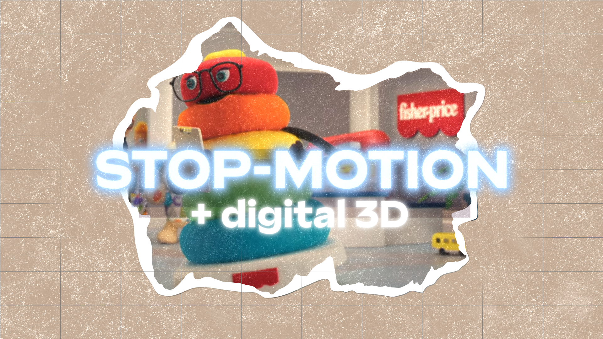
As the above video demonstrates, the stop motion animation process is by no means completely analog. This next promotional video for Fisher-Price is an example of an animation that goes for a stop-motion aesthetic, though it’s digital 3D animation.
And the call back to the Rankin/Bass style of stop motion is well suited for the product (not-so-misfit toys):
-
This video makes good use of the reverse angle shot (AKA shot/reverse shot sequence) as it follows the dialogue of Ms. Ring Stacker and Judy. A reverse angle shot shows what is roughly 180 degrees opposite the previous shot. It’s usually a shot of who the subject is talking to or what they are looking at, or the reaction of the subject to the previous shot.
Shot/reverse shot sequences are a staple of character-driven stories and you can use it to effectively capture conversations between subjects.
Another type of stop motion is one that animates the process of creating images using traditional art materials, like ink, charcoal, or paint. This video for the On Being podcast uses hand-painted images on the pages of a poetry book to reflect the abstract fluidity of the subject matter:
-
The final shot of the animation is a sort of tight two-shot, which is where two subjects are included in the same frame. Two-shots can be used to show a close relationship between the two subjects. And that is a great compositional choice for this shot that accompanies the voice-over line, “And are we not of interest to each other?”
Claymation
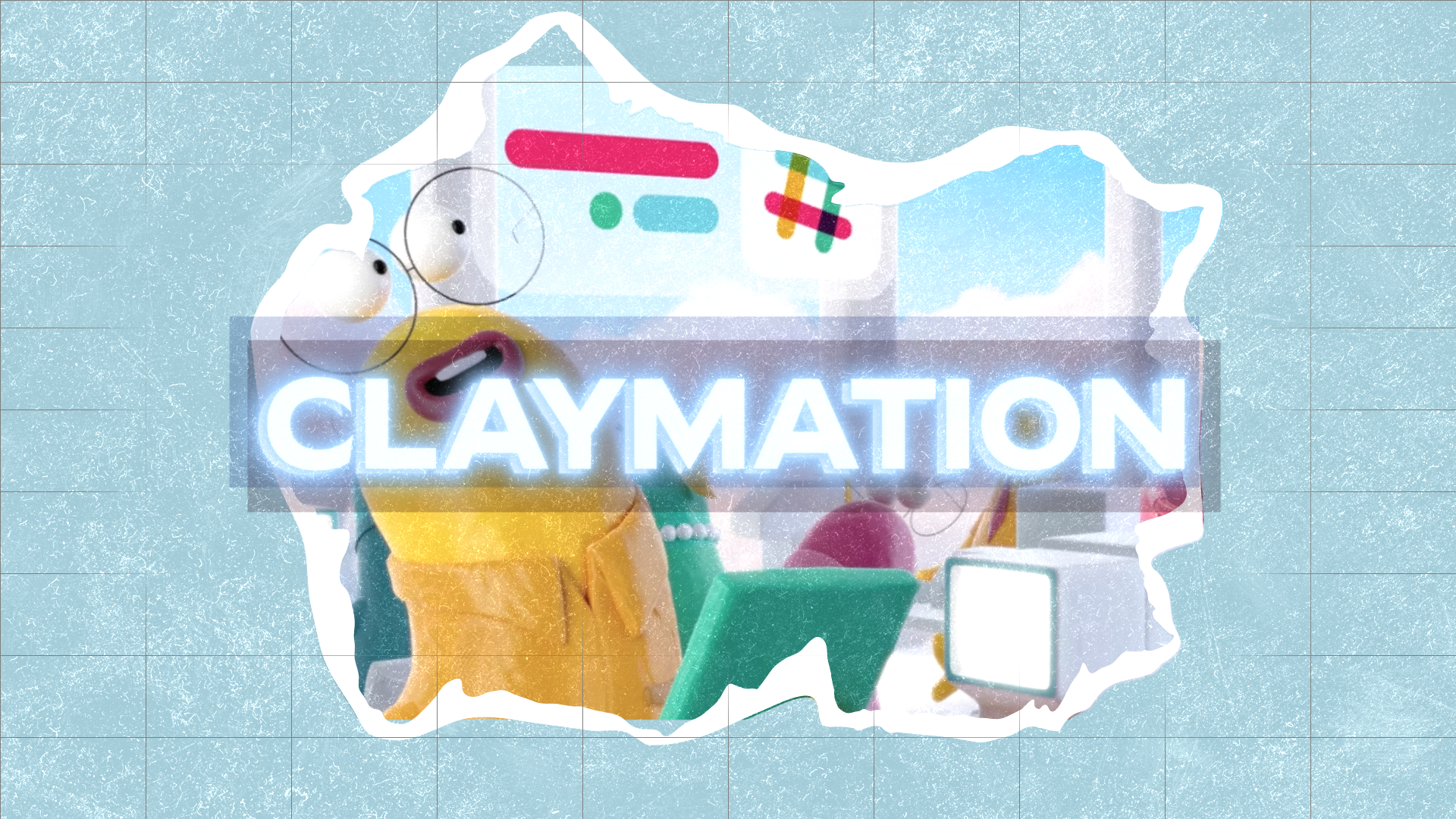
This style is an oldy but a goody and can give off playful or artful vibes. It is a sub-style of stop motion where the animated objects are made of clay. Though, the claymation videos you see today are likely created digitally and styled to have that hand-molded look - without the painstaking hours of manipulating clay.
Here’s an example of digital claymation from Slack:
-
Look one more time and you’ll catch quick examples of tilt and pan camera movements at 11 seconds and 24 seconds, respectively. A pan is when the camera stays in one spot and turns from one side to another. A tilt is similar, only the camera tilts up or down.
Fast pans or tilts like these tend to have more of a comedic, cartoony effect, while a slow pan or tilt can subtly build anticipation or suspense.
Now, if you want a look at a video with traditional claymation that pushes the expressive capabilities of clay to the limit, check this video out. Could this approach apply to corporate video? Maybe, maybe not. But it's a pretty cool video.
Character animation
Character animation can be done in nearly any animation style, so this term refers to a specialized part of the animation process that brings characters to life. It’s a particular skill set and some people devote their entire careers to it.
You’ve already seen several examples of great character animation in the previous videos, but why not a couple more? This one for Spotify gives you a tour of several characters and shows how everything from their props to their movements works together to create a character:
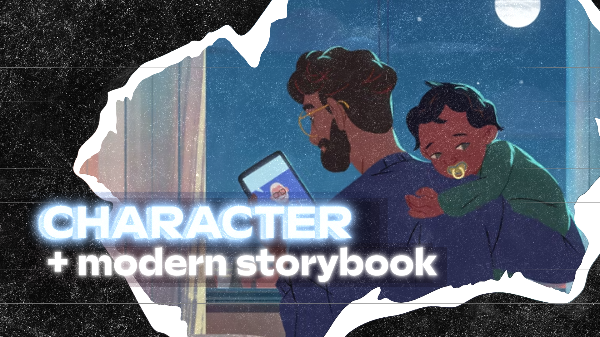
This video for BlueCross BlueShield North Carolina shows off some Disney-like character animation. The animation style is an example of 2.5D animation, where 2D illustrations exist in a 3D space. (This style can also be achieved using 2D images and a parallax effect.)
These style choices give the video a modern storybook feel, humanizing the healthcare brand in a service category that’s often knocked as being too impersonal. It’s perfect for an audience of parents hoping to soothe their restless kiddos:
Now, are you ready to compose your masterpiece animated corporate video?
More Animation Inspiration
Don’t forget, if you want more animation inspiration, tips for optimizing your production process, or a framework for choosing the right animation style for you, get our e-guide!


